Friday, April 7, 2017
Tuesday, May 10, 2016
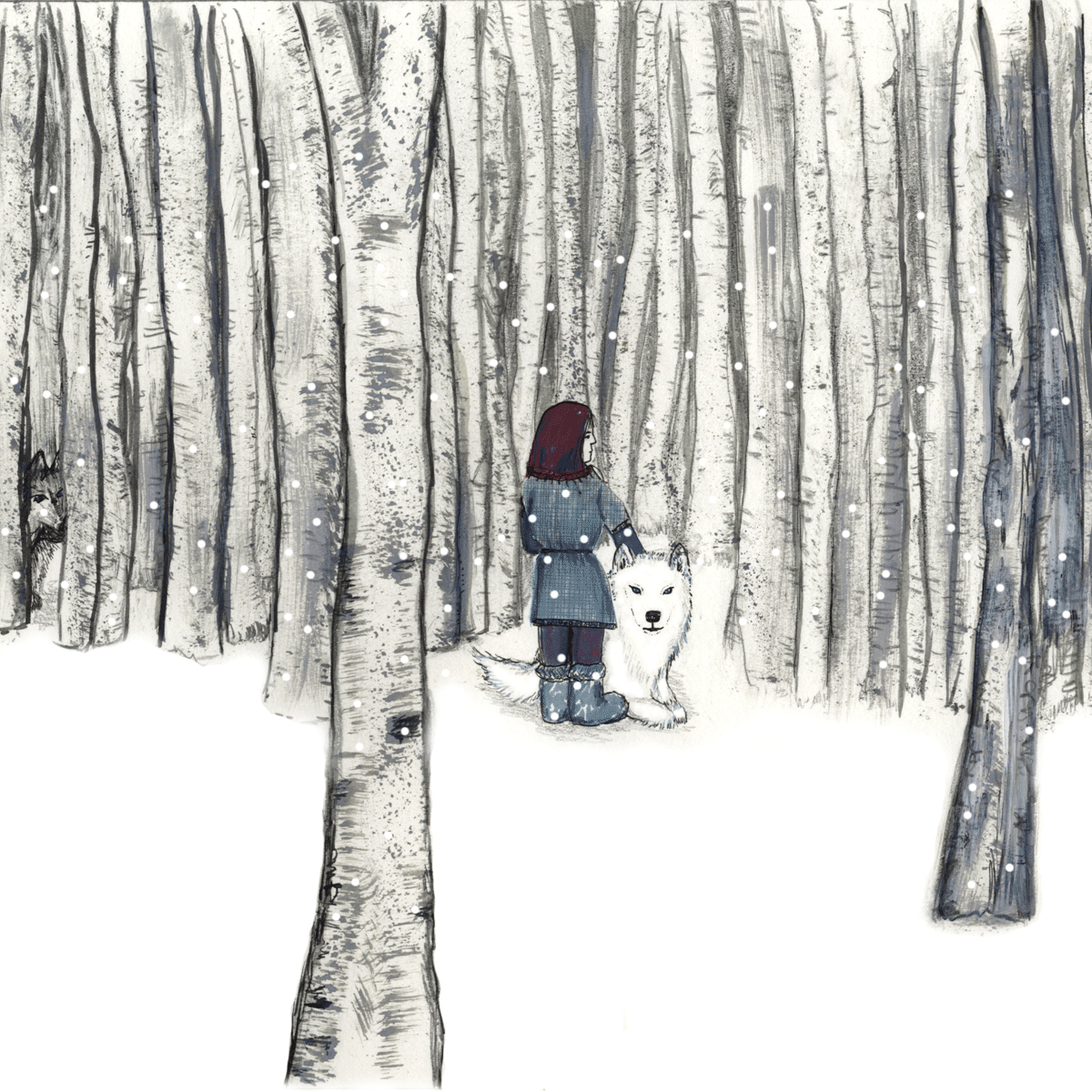
Final images
Book Cover gif and three illustrations


Smelly dog gif

Contextual piece for digital
processes
After looking at the book
list and researching the various themes, I decided that the book that interested
me was My Family and other Animals by Gerald Durrell. A delightful and
entertaining read. Gerry’s mother and her chaotic existence of family life and
often over bearing children, with their quirky unique characters on a foreign
island sums up the story. I felt this is the sort of book I would like to
illustrate.
Primary sources were travel
magazines of Corfu where the book was set, my own photos of Corfu and some images
from the Internet. I wrote lists/ bullet points of things I thought were of use
as images or notes of the characters and scenes in the book. I looked at the
era, and location set in Corfu in the 1920-1930’s. Researching fashions, hairstyles,
textiles, transport and a little history.
I experimented with watercolours, gel wax
crayons, pencils, collage, textiles, fine liner drawings and photos. Most of my
drawings focused on Gerry and his obsession with animals, those he collected as
specimens, his pets and various aspects of Corfu’s nature. Things he would use
on his mini expeditions including butterfly nets, binoculars, magnifying glass,
reference books and microscopes. Various compositions were tried before final
thumbnails were decided on.
I didn’t want a vector type
style of Illustration and so chose to work in Photoshop for that reason. I
scanned the variety of images I was to use and set everything up to work bigger
than needed. I would change the sizing later.
I looked at Illustrators who
used drawing and pattern in their work. I researched Laurie Hastings and Lauren
Child. Although these illustrators use lots of drawing, collage and pattern
work, I knew I only wanted to use this in some of my images.
Laurie combines patterns and
textures beautifully with digital processes. Despite having a full page she doesn’t
overload or overwork her images. This is something I have tried to consider with
my images. I really like her
collaboration work with the poet David Troupes. I found this image after I had
created my student in a hoodie image below in Illustrator. I can see a similarity
with the digital colour work and use of sketches.
Lauren Child’s work however
had similarities to that of Hastings. She also uses patterns, textures and
drawing work but both illustrators have very different styles. Lauren also uses
items such as photos, bits of books, magazines and other found things. I think
she works in this way because like me, she can see use for things other people
would throw away. I have used this same type of image making with the dreams/
nightmares and opposites brief using found photos, textures and drawings. There
are pros and cons to using this way of illustrating as it can be very time
consuming working on both the analogue and digital side of work.
Another illustrator I
researched was Patrick Leger. I chose Patrick because I love his simple vintage
style and hand drawn digitally enhanced compositions. He seems to make the most
ordinary scene look extra-ordinary. He achieves what I think is key to a good
image. It makes you want to see more of it. It questions what’s beyond the
border of the picture? What does the woman look like? What does the guy have in
the bag? Who or what is he looking at?
His colours reflect the era
and style of a bygone age. I have tried to keep this style in my mind when
creating my images for the book cover. The colours and loose hand drawn
elements I have used help represent the fun, lighted hearted nature of the
book.
I struggled to use
Photoshop at the start my technique being quite clunky, despite having my
notes. As time went on I sped up and recognized my mistakes more quickly.
This allowed me to be able to correct my work and feel happier with the
results. As my images developed I felt more confident to add things and be
bolder with them and the colours I used.
I sometimes got a bit lost
with knowing what I wanted to achieve, but couldn’t quite remember how to get
there. I have had lots of trials and errors before feeling more competent.
|
Overall I am happy with what
I have achieved and in particular like the tea party and smelly dogs images
because they are fun. Looking back the tea party image could also have worked
as a book cover and a gif.
As I feel more confident
with Photoshop now I will find it easier to achieve results quicker. I have
found that by using digital processes I have been able to achieve better
results than solely by hand.
Experimenting with my images in a more varied and rapid fashion.
In hindsight I feel I should
have included more of the processes I have learnt over the past few weeks. Although I did experiment with the pattern
and brush tools with one or two ideas, I didn’t use them in my final images. In
the future I would like to use more patterns/textures and some of my found
objects, once I find the right project for them. I also need to get more
practice with other tools in Photoshop and on Illustrator as this is a useful
tool to and would like to use it in the future for possible laser cut imagery.
Bibliography
A life in Illustration, the most famous illustrators and
their work. (2013) Gestalten
3x3 The Magazine of Contemporary Illustration. (no date)
[Online] Available from: http://3x3mag.com.
Beginner’s guide to digital painting in Photoshop. (2011a)
3DTotal.
Beginner’s guide to digital painting in Photoshop. (2011b)
[Worcester], 3DTotal.
Bickford-Smith C. (2015) The
Fox and the Star. Penguin UK.
Blexbolex Seasons (2010) Enchanted Lion books.
Bowater C. (no date) Beginners Guide to Digital Painting in
Photoshop: Characters. 3dtotal Publishing.
Chen Design Associates (2006) Fingerprint: the art of using
handmade elements in graphic design. Cincinnati, Ohio, How.
Computer Arts Magazine, Future Publishing. (no date)
Computer Arts. (no date) [Online] Available from:
http://www.creativebloq.com/tag/illustration.
Creative Quarterly - The Journal of Art & Design. (no date)
[Online] Available from: http://www.cqjournal.com.
Child L. (2005) Hubert
Horatio Bartle Bobton-Trent. Hodder Children’s books. London.
Durrell G. (2011) My family and other animals. Penguin
Books.
Fowkes A. (2014b) Drawing type: an introduction to
illustrating letterforms. Beverly, MA, Rockport Publishers.
Hyland A. (2001) Pen and mouse: commercial art and digital
illustration. London, Laurence King.
Ingledew J. (2011) The A-Z of visual ideas: how to solve any
creative brief. London, Laurence King..
M.P.Verneuil (1976) Art
Nouveau Floral Ornament in Colour. Dover
publications inc. New York.
Marita Vermeulen (2006) Colouring outside the lines. Flemish
Literature.
Perry M. (2007) Hand job: a catalog of type. New York,
Princeton Architectural.
Rivers C. (2011) Handmade type workshop: techniques for
creating original characters and digital fonts. London, Thames &
Hudson.
Zeegen L. (2005) Digital illustration: a masterclass in
creative image-making. Mies, RotoVision.
Zeegen L. (2014) Fifty years of illustration. London,
Laurence King Publishing.
Zeegen L. (2007) Secrets of digital illustration: a master
class in commercial image-making. Mies, RotoVision.
Wednesday, April 27, 2016

Subscribe to:
Posts (Atom)