Thursday, February 25, 2016

Week 4

This week looked at how we could use drawings for surface pattern 
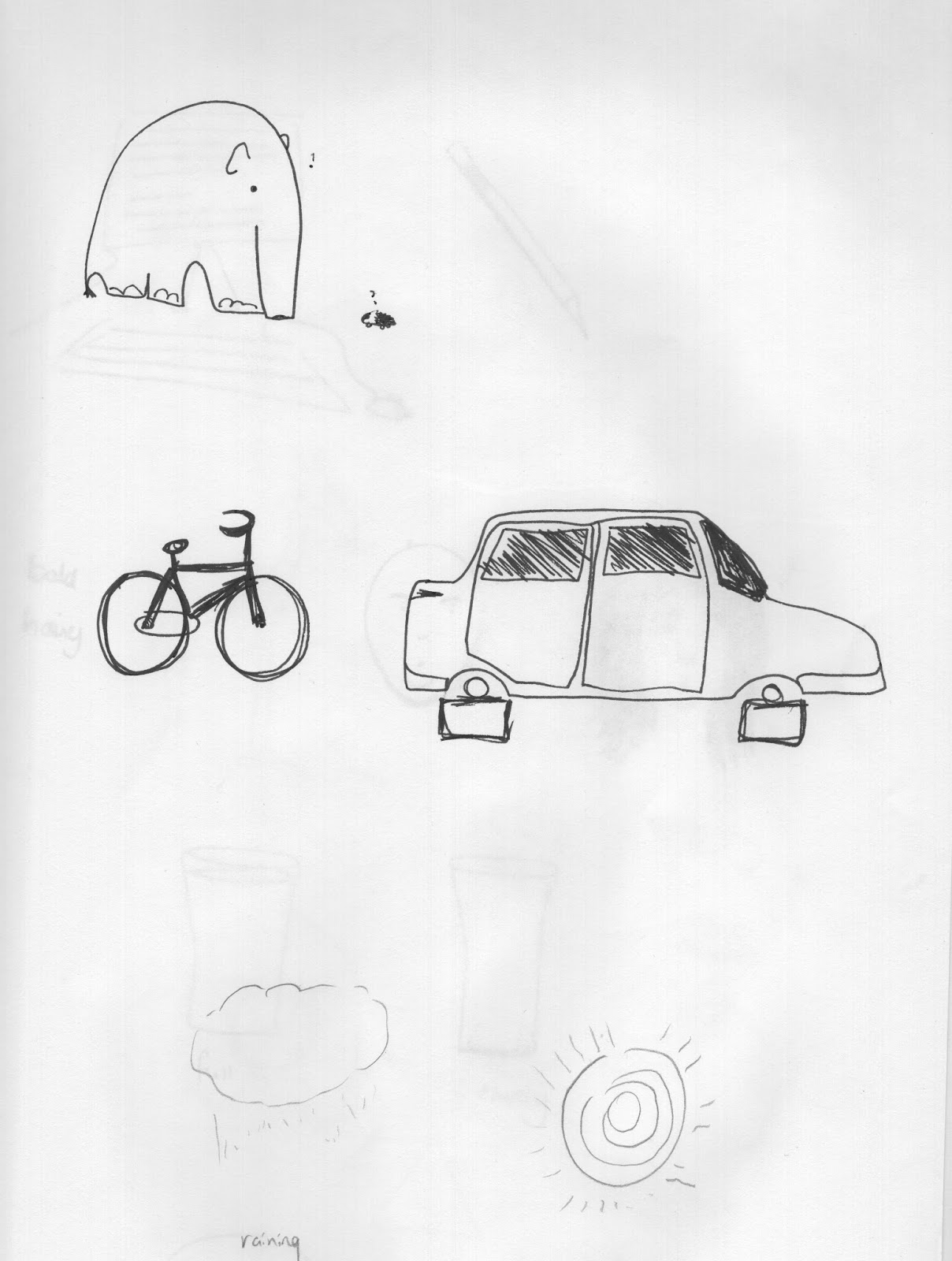
design. After collecting a number of pages of drawings of transport, food, wildlife and sports. I learnt how to create pattern swatches which was a slightly similar process to making the brushes. 


I changed the size of the image I wanted and the pixel size to 1200 by 1200 this would help me later on if I wanted to change the pattern into a drop pattern. I changed the threshold and size until I was happy with how it looked. I was then ready to make my pattern.


I really enjoyed this and made two straightaway. I wanted to create a vintage style look to the patterns. So it possibly could be used for stationary or gift bags/ wrapping. I chose faded/muted colours as I thought this would suit what I had in mind. I thought this worked well for the unicycle but not so well for the ice skates and hot air balloon.


I created my pattern similarly to how i created a new brush so this was easy to remember.


So i went onto do another design in Ice skates. After some help I had moved onto a half drop pattern, by extending the size of the page and moving the anchor point to the middle. It gave an effect of splitting the image in two. I re-arranged the image to make it a half-drop pattern. I then used the bucket tool to drop it onto a new sheet.


I took screen shots of the results.


Here are the finished patterns on a larger scale.


I struggled with retaining information on the half-drop pattern stages of the session. I have however looked at the pdf on blackboard for help.


Although I have remembered most exercises as I go along, others are taking a while to embed. On this occasion I was opening new files every time I completed a new pattern instead of keeping them all on one file. So I had to learn the hard way and save everything separately on jpeg for artwork, print and web. It took me forever.


Thursday, February 18, 2016

Week 3

Week 3- Making and using brushes


After spending a few hours painting various patterns, texture and limbs with black ink. I scanned them in on the copier to my memory stick. Only to find I hadn't pre-set the image to save as a jpeg and saved them as pdfs! It is taking me a little time to get the hang of remembering the basics. But I am getting there.

The first part of the brief was to create new brushes and make a brush test sheet. I did this by using the selection tool to pick an area I wanted to use then clicking onto brush preset and naming the new brush. I picked this up easily and quickly created a number of different brushes for the sheet.
I then moved onto the second part of the brief, which was to create animal images out of the brushes. I thoroughly enjoyed this and began to realise how much use Photoshop could be to illustrators, including saving lots of time and fiddling about.


I considered my brushes and thought of what type of animals would suit them. I chose a Sheep, a Snake, a Horse, an Octopus and a Peacock. Using the different options available such as increasing and decreasing the spacing of the brush size, orientation, and colour, I experimented until I was happy. I quickly began to produce a variety of images.  Using the eye shaped brush in different colours has worked well to create the feathers, head and wings of the Peacock. By changing the distance between the brushstrokes. I made large and small size spotted and striped markings to draw the Horse and Sheep. I think that this has given them a slightly 3d effect. I tried to add depth to the Octopus and Snake pictures by using more colour and multiple brushes. I am extremely happy with my results.

I feel as though I am picking up Photoshop much quicker now. But I must remember to start pictures on a new layer not the background sheet. I also still forgot to do some basic things regularly like saving the document or how to save the file for web use. 


I did however remember to take a few screenshots of my processes and the work I had produced.


Friday, February 12, 2016

Week 2

Week 2- Opposites


The variety of opposites I had collected for this session included photos and loose fine liner sketches. I looked at fat /thin, old/ young, hairy/bald, big/small etc. I spent more time scanning and messing around with scans than I wanted to. Due to making mistakes and getting used to the process. This is probably the best way to learn even though I felt I was running behind.
After refreshing myself with the tools on Photoshop again I started to think creatively with the images I had. I wanted to achieve an almost odd image slightly crazy feeling. I tried to think of Marion Deuchars work where she combines ink work drawings with photos to create images. I tried this approach with both my images. The most successful opposite was combining an old woman’s neck and body with the face of a young child. I have used a line drawing to create a large lion medallion around her neck. Just the opposite of what you would expect to see on an older lady. On reflection I would have liked the character all in colour or all in black and white.  Not the mix that it is.  Although I don’t think my lady bottle stop image worked as well as an opposite, I do prefer it as an image. This is because it is similar feel to the exquisite corpse images from another module. The woman’s head as a poison bottle stopper, the label being a hand drawn picture of an Elephant and crossbones works really well together

I have really enjoyed this week although towards the end I couldn't see properly as I had spent too much time staring intently to the screen. I felt dizzy for hours after and don't believe I was actually that safe to drive home! Lesson learnt though, keep looking away from the screen. Don't become too obsessed with details unless you take a break regularly.

Some of the photos and drawings i used for this exercise


Tuesday, February 9, 2016

Week 1- Nightmares and dreams

I am not used to illustrating using technology and am not very technically minded at present. I feel quite out of my depth using Photoshop. After considering the brief. I tried to think of things that I would consider as Nightmarish. One character from the children’s animation film Toy story sprang to mind. It had a dolls head on a mechanical spider like body. An arachnid type image to me was a nightmarish image. I looked at the images I had and those provided and tried to combine something that would be quite freaky. I had trouble initially with enlarging and moving the objects, but then discovered this was down to being on the wrong layer before trying to do something. After then remembering to name the layers, I found it easier to find my way around although it was slow going.
I think that the image works because it is surreal. Although I think it could do with a little tweaking, to make the limbs work better. Even though it is quite simple compared to other images produced. I feel as though I have learnt quite a lot during the session. Such as what some of the tools are for and how to set up an initial document.
Although I did take screenshots I haven’t managed to save them from this week due to technical difficulties.


Here is my image from the Nightmares and dreams session.